Preferred Partners
The Client
Preferred Partners is a full-service Office of Supervisory Jurisdiction (OSJ) founded in 1998 and committed to helping seasoned financial advisors grow their practices, increase office efficiency, and maximize profitability. The team, led by Founder and President John Fenwick, is one of the biggest OSJs with Cambridge Investment Research, Inc.
The Task
Preferred Partners had an outdated and mostly nonfunctional website that was no longer meeting their needs. The website had a large number of broken links, an outdated interface, no calls to action, and it was difficult for the staff to maintain and update. This is what is used to look like, courtesy of our friends at the Wayback Machine, and a preview of the new site:


As you can see, the site lacked any substantive calls to action, its information was not up to date or easily accessible, and it was not serving the needs of its constituents. What you can’t see, is that is was also not in any way responsive, or mobile accessible. Our update fixed both of these shortcomings.
The Design
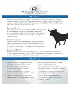
Preferred Partners wanted to update their visual identity in addition to improving the functionality of their website. We kept their logo at their request, but additional ways to integrate it into the site. We developed a new color scheme from their logo as well, primarily focusing on blues and grays, with greens for accents.
They also liked the idea of bulls and bears since they are a financial advising company. We worked this into a cohesive visual identity for them as well.
The Function
We had a number of challenges in reforming the Preferred Partners website. Our first task, as always, was to make sure the website met the needs of its users. In the case of Preferred Partners, the majority of the users were financial advisors, not the general public or clients of financial advisors, so we had a somewhat limited pool of potential users which allowed us to narrow our focus.
We created a homepage that focused on informing visitors on what Preferred Partners was all about, and directed them to relevant parts of the site for them, including the services provided by Preferred Partners, the team members involved, and contact information.
We built the rest of the site, however, to service the needs of the financial advisors who are the main constituents of the site, and we made sure that enough of the calls to action on the site were directed towards these visitors that they would get to where they needed to be.
The areas of the site aimed at these visitors include an advisor directory with contact information for all the advisors represented by Preferred Partners, and a database of resources designed for advisors that they can download freely from the site. In addition, we included a way for Preferred Partners to highlight advisors and their achievements.
We also created an event calendar for the Preferred Partners team to highlight their upcoming meetings and events.
Additional Materials
We’ve continue to produce supplementary materials for Preferred Partners, alongside our friends at JackieBWriting.


